
YES, Framer X seems to be the first design tool, which integrates a framework like React perfectly. Ok, well, there is always room for improvements, but it works and there are some nice features regarding this topic announced by the product owners @FramerX.

Framer X calls a React component a “Code Component” and they are written in Typescript. Don't be scared of Typescript if you are not used to it. Follow the track in this tutorial and you will see how simple it is to write a code component.
Using external libraries like styled-components does work as well! In this how-to we will create a Button component in Framer X using styled components.
If you have never heard of styled-components before I recommend you to read their docs. It's pretty awesome. If you are new to react, then you should do a basic react course before.
Steps to create a styled component in Framer X:
- Create a new code component
- Install styled-components
- Set up a Button
- Create Button variations
- Add property controls
Let's begin!
1. Create a new code component
Create a new project in framer and go to the component tab.

Click on new, select “Code” and enter a title e.g. “Button”. You preferred editor should open a Button.tsx file.

2. Install styled components
A Framer X project is a npm project, so we can add dependencies like for every other application.
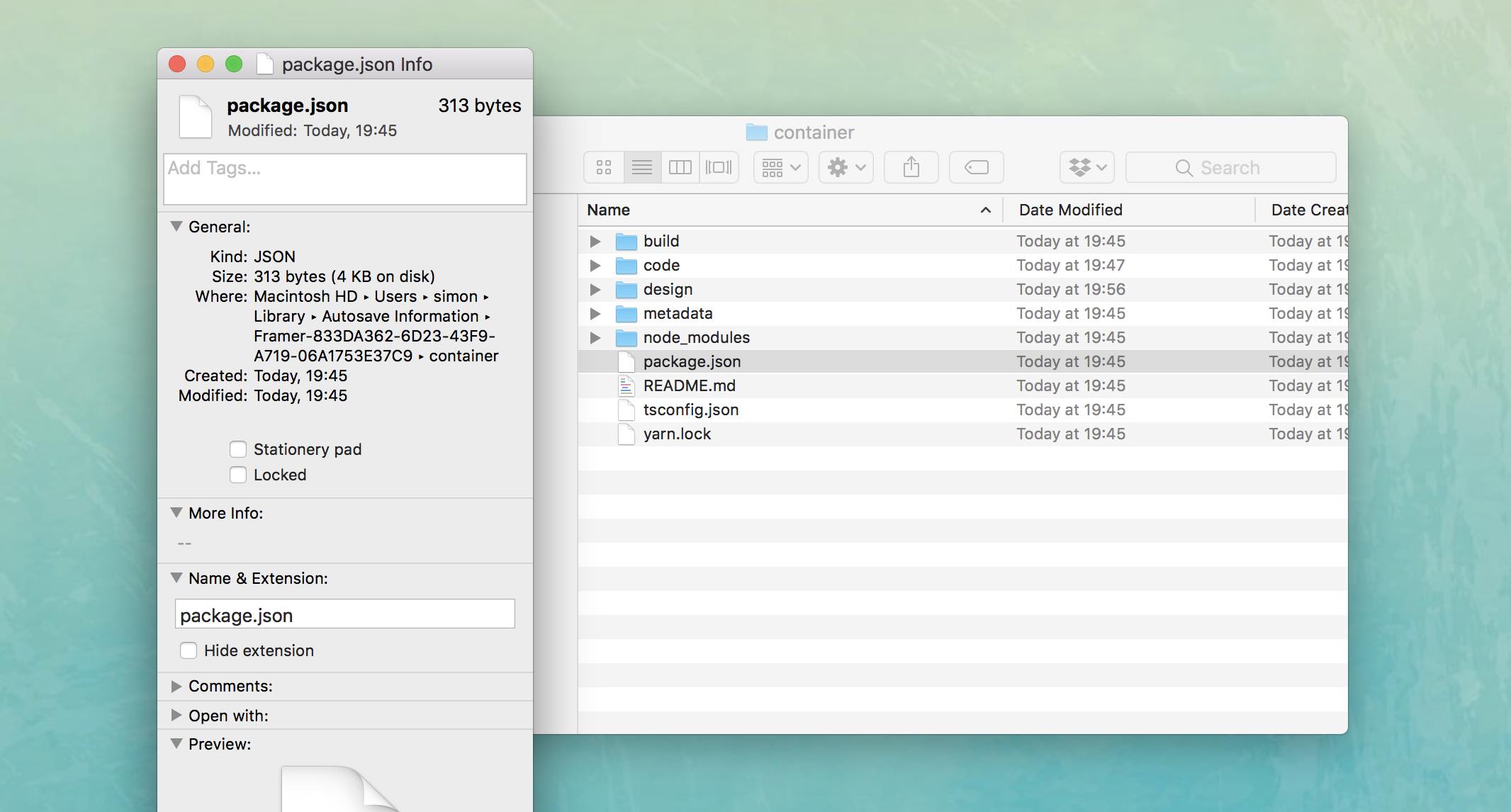
Your .framerx project file is nothing more than a zip file and if you open a file it holds a copy in Mac's Autosave path.
To open the project path click on File > Show Project Folder. This will open a Finder window with your project.

Find out the path to your project. It will be something like this:
~/Library/Autosave\ Information/Framer-833DA362-6D23-43F9-A719-06A1753E37C9/container
Open the terminal and change the directory with:
$ cd ~/Library/Autosave\ Information/Framer-833DA362-6D23-43F9-A719-06A1753E37C9/container
The command cd means change directory, and ~ is the path to your users home directory.
If you struggle finding out the right path to your project:
- Right click on package.json > Get Info.
- Copy the path.
- Be ware of the copied “
Autosave Information”. You have to change this to “Autosave\ Information", because in Terminal you don't have a empty space.
If you are in the project folder we can install the npm package styled-components for your project:
$ npm install styled-components
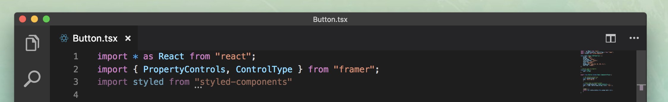
Go back to your editor where you opened the Button.tsx file and add the following import declaration at the top:
import styled from 'styled-components'
You Button should now work with styled components. But we haven't setup any elements or styling. Lets go to step 3.
3. Set up a Button
Let us remove in line 5 all the CSS-Property stuff because we want to replace this with a styled component.
Add a basic styled a button tag with some styling:
const StyledButton = styled.button`
  padding: 20px;
  border-radius: 10px;
  border: 0;
  font-size: 2em;
`
If you wonder about the ` ` syntax: This is called Template Literals and this is a additional way to handle dynamic strings or templates. It provides a simpler solution e.g. to concat string and variables. If you like to know more about strings and template literals in javascript I can recommend to read this article.
Use your StyledButton in the render method of the component:
render() {
  return <StyledButton>{this.props.text}</StyledButton>
}
Your component should now look like the following:
import * as React from "react"
import { PropertyControls, ControlType } from "framer"
import styled from "styled-components"
const StyledButton = styled.button`
  padding: 20px;
  border-radius: 10px;
  border: 0;  font-size: 2em;
`
// Define type of property
interface Props {
  text: string;
}
export class Button extends React.Component<Props> {
  // Set default properties
  static defaultProps = {
    text: "Hello World!"
  }
  // Items shown in property panel
  static propertyControls: PropertyControls = {
    text: { type: ControlType.String, title: "Text" },
  }
  render() {
    return <StyledButton>{this.props.text}</StyledButton>
  }
}
4. Create button variation
Let's use the benefits of styled components and Framer X. What does every design system have: Yes, a primary and a secondary button.
Let us add some variation for our button.
const StyledButton = styled.button`
  padding: 20px;
  border-radius: 10px;
  border: 0;
  font-size: 2em;
  ${props => props.primary && css`
    color: white;
    background-color: green;
  `}
  ${props => props.secondary && css`
    color: white;
    background-color: blue;
  `}
`
css not found? No worries, let us import it from styled components:
import styled, { css } from "styled-components"
Use the property in the component:
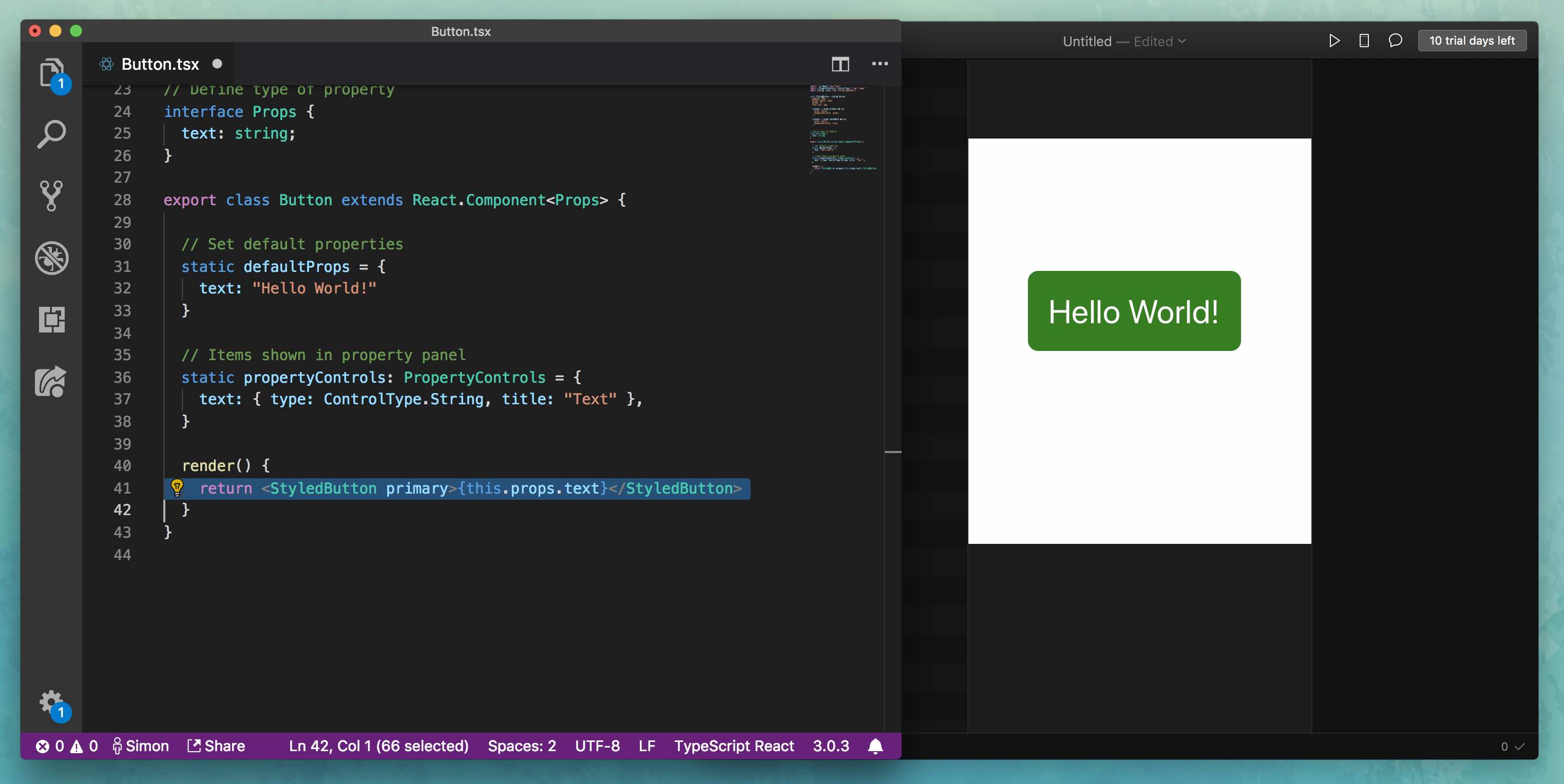
render() {
  return <StyledButton primary>{this.props.text}</StyledButton>
}
// or secondary
render() {
  return <StyledButton secondary>{this.props.text}</StyledButton>
}
5. Add Framer X property controls
Changing the property in the code is a bit unhandy. Let us create a possibility to change the type of the button in Framer X.
Add a new property, e.g. “type”
// Define type of property
interface Props {
  text: string;
  type: string;
}
Let's assume we want a default primary button:
// Set default properties
static defaultProps = {
  text: "Hello World!",
  type: "primary",
}
Add a new property control for our type selection. We are using a ControlType.Enum to achieve our goal:
// Items shown in property panel
static propertyControls: PropertyControls = {
  text: {
     type: ControlType.String,
     title: "Text"
   },
  type: {
     type: ControlType.Enum,
    title: "Type",
    options: ['primary', 'secondary'],
    optionTitles: ['Primary Button', 'Secondary Button']
   },
}
If you go to Framer X you should see a option selection for the type of the Button.

But, well, nothing is changing, when we hit the selection. That's why we did not use the type-property in our component.
We have to change a bit the code. First we want to overhand the property to the styled-component.
render() {
  return (
    <StyledButton type={this.props.type}>
      {this.props.text}
    </StyledButton>
  )
}
In our StyledButton we can now decide based on “type” which button styling we want to load:
${props => props.type == 'primary' && css`
  color: white;
  background-color: green;
`}
${props => props.type == 'secondary' && css`
  color: white;
  background-color: blue;
`}
Congrats! Try it out in Framer X!
You now have a very basic understanding of how a to integrate a third part library in Framer X and how to create a basic component with variations.

Thanks for reading! I’m Simon Franzen, co-founder of zauberware. Feel free to connect with me via Twitter.
You can find the final sources of this How-To in my gist: https://gist.github.com/simonfranzen/f46ff1a8b24356f6729d11a6ca8b968b