
Do you need a mobile optimized website at all?
We are writing the year 2019, so there shouldn't be any discussion that your website has to work on all screen sizes. Even if you are only offering B2B services, the chances are that 50% of your potential clients are accessing your website with a mobile device. If you don't believe me, then have a look what Google says about it here. Furthermore you are killing your search engine ranking if your website doesn't work for smaller screen sizes.
The “mobile first” - mantra
If you start looking around for someone designing & developing your website you often hear: “We are going to develop it mobile first.”
I am a big advocate of the “mobile first” approach, where you design your mobile views first, then the larger views and follow that path with your development as well. Why this is so important and makes everyone's life easier will be explained another time.
For me the mobile first approach defines the order of design and development, but not that you should always allocate the most budget to the mobile views.
Get the most out of your budget
Now that we have clarified that “mobile first” refers only to the chronology, I would like to have a look at the budget constraints you are usually facing creating a new website or doing a relaunch.
Usually, you start with a specific budget, which is based on the business value you expect from your new website.
Next steps are to define which kind of visitors you want on your website, what content they are looking for and which design would match their expectations. Before your content creators and designers are jumping in you should also think about how your website content is consumed, which comes down to screen sizes and browser versions.
Naturally, your website should work on all screen sizes. No discussions.
Also, if you follow the latest StatCounter statistics you could balance your budget 50/50.
However, sometimes your gut feeling already tells you that most B2B websites are accessed more often via desktop and B2C online shops probably more via mobile browsers.
Thus if you know how your primary audience is consuming your website, you know where to include the fancy stuff: unique animations, surprising eye-catchers, call to actions,...
Let the data decide
It comes down to two possibilities: either you are already gathering statistics, for example with Google Analytics, or you don't.
If you don't have any statistics, you are either just starting with a brand new website, or you are already running one without any statistical tools installed. In case you already have a website I would recommend to connect Google Analytics, which is usually done within a few minutes for the connection and to get the legal disclaimer into your privacy agreements. Just let it run for 4-6 weeks, and you should have sufficient data on how your website is accessed.
If you are just starting with a new website you are a bit out of luck, you have to either follow your gut, google for relevant statistics in your market, or, the best way to do it, try to ask potential customers what they would expect from your website and how they would access it.
How to check screen sizes in Google Analytics
So you have Google Analytics running, maybe even for a few years, and have never checked the screen sizes?
You don't need to hide. I am often surprised that even specialized web design agencies are not checking all Google Analytics statistics before they start working on a new website.
Just login to your Google Analytics accounts for your website and select Audience → Technology → Browser & OS.
The next selection is a bit hidden, a small menu on top of the browser list where you can select “Screen resolution". Click on that, and you should see a list like this one:
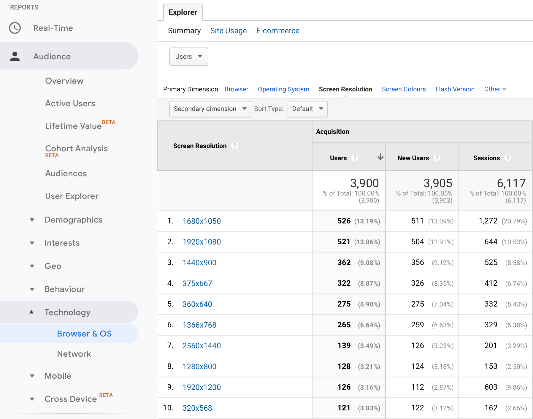
Based on the information you find, maybe filtered by different time frames, ideally, between three and six months, you can decide based on the data how to balance your effort between the different screen sizes.
If we have a look at the list above we can see that our zauberware website has been visited by desktop and mobile users around 50/50. What stands out are the high resolutions of the screens, which shows us that either latest retina displays have been used or external monitors. We know now that we not only need to have a look at mobile vs. desktop but also for high resolutions and large monitors.
A B2C example for comparison
To get a feeling for the difference, let's have a look at one of our clients which produces some of the most excellent wines on the planet: “Weingut Franzen” in Germany:
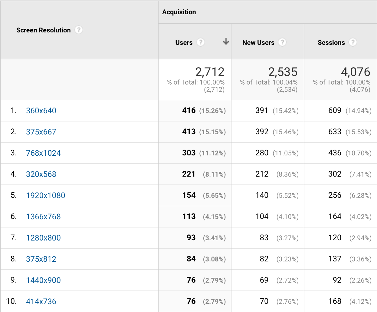
Can you spot the difference? I bet you can.
We have more focus on mobile screen sizes and even a tablet on place 3, which doesn't appear on our zauberware website at all. Thus you should focus here on the mobile experience.
You are probably curious what else can be found out with a few clicks in Google Analytics. If you'd like we could have a look together. Just schedule a webmeeting with me at http://calendly.com/marcus-franzen free of charge.
Thank you for your time & interest.
Thank you for your interest and your precious time. If you would like to contact us, you can do that via our chat on this website, where you can also book an appointment for a web meeting which is free of charge.
Picture credits
Vegetables by Charles 🇵🇭on Unsplash. Many thanks!