Your prototype usually needs click handlers, animations, transitions etc. Let's dive into a real world example and I show you how you can connect clicks with animations and how to share data between code components.
As an example we will create a button component and a menu component. The click on the button should slide in the menu.
Steps to create a menu toggler in FramerX:
- Create a simple Menu component
- Create a Button
- Setup a Menu Code Override in FramerX
- Setup toggler with onTap
- Using framers Animatable
1. Create a simple Menu component
Let's start with the Menu we want to slide in from the top. Go to the component tab in FramerX and create a new code component:

Add a property isOpen to the Menu component. Dependent on this property we let the Menu slide in or up.
// Define type of property
interface Props {
  isOpen: boolean;
}
Add a default value for isOpen. I would say: false
// Set default properties
static defaultProps = {
  isOpen: false
}
To test the component view Controls in FramerX you could add a property control as well
// Items shown in property panel
static propertyControls: PropertyControls = {
  isOpen: { type: ControlType.Boolean, title: "Menu Toggle" },
}
Import styled-components if you haven't yet and create a few stylings for our menu.
For the beginning, let us define the slide in and out animation with pure css.
Per default the menu is getting translated -100% to the top, that it is out of the view. If isOpen == true, it translates the view back into the view. How simple!
//...
import styled, { css } from "styled-components";
const StyledMenu = styled.div`
  background-color: black;
  color: white;
  padding: 20px;
  height: 100%;
  width: 100%;
  position: fixed;
  top: 0;
  transition: .6s ease-in-out transform;
  transform: translateY(-100%);
  ${props => props.isOpen && css`
    transform: translateY(100%)
  `}
`
Use the created StyledMenu in the render method of the component. We will also set the isOpen
render() {
  const { isOpen } = this.props;
  return <StyledMenu isOpen={isOpen}>My StyledMenu</StyledMenu>;
}

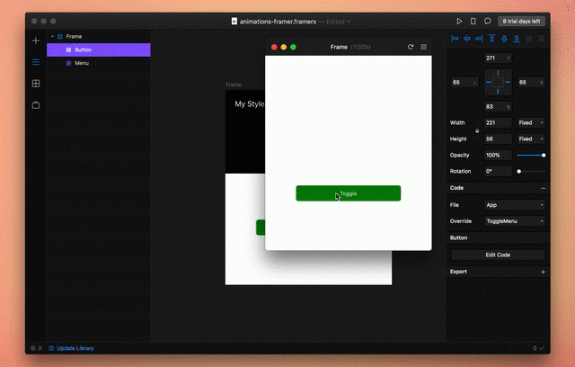
Open FramerX and add your created Menu to a view. Use the toggle control in the right sidebar to slide up and down the component.

2. Create a Button
Our next goal is to create a another component, a basic Button. The Button also has a property isOpen.
If isOpen == true, the button is active and just as an example I reduced the opacity.
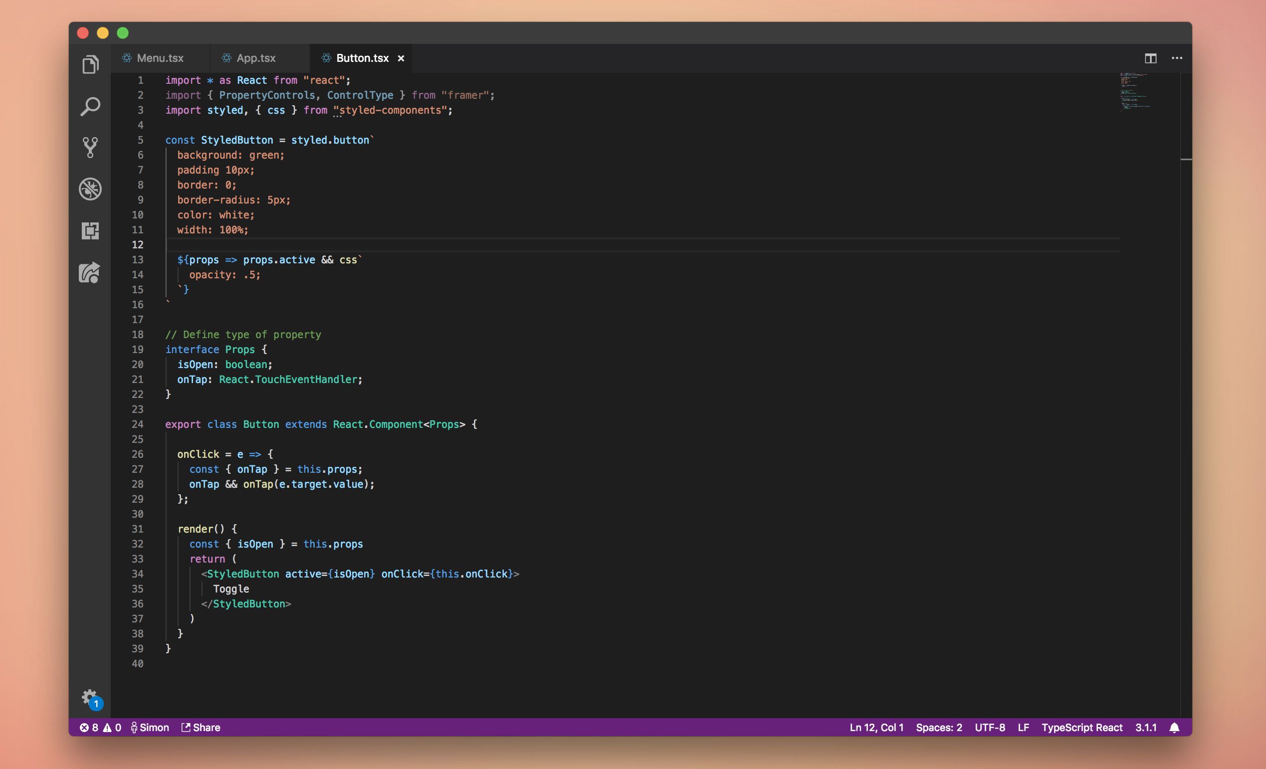
import * as React from "react";
import { PropertyControls, ControlType } from "framer";
import styled, { css } from "styled-components";
const StyledButton = styled.button`
  background: green;
  padding 10px;
  border: 0;
  border-radius: 5px;
  color: white;
  width: 100%;
  ${props => props.active && css`
    opacity: .5;
  `}
`
// Define type of property
interface Props {
  isOpen: boolean;
}
export class Button extends React.Component<Props> {
  render() {
    const { isOpen } = this.props
    return <StyledButton active={isOpen}>Toggle</StyledButton>;
  }
}
Add the button to your FramerX project.

But currently nothing happens when you click on the button. Lets go to step 3 and set up a Code Override to create a click handler and a shared property isOpen between Menu and Button.
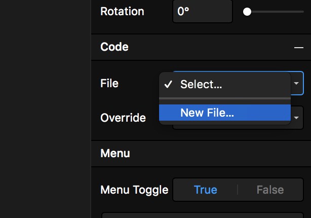
3. Setup a Menu Code Override in FramerX
Create a new Code Override, let's call it App.
In that file we define MenuToggle Override. This override holds the state isOpen and provides a onTap function to toggle the isOpen bool.
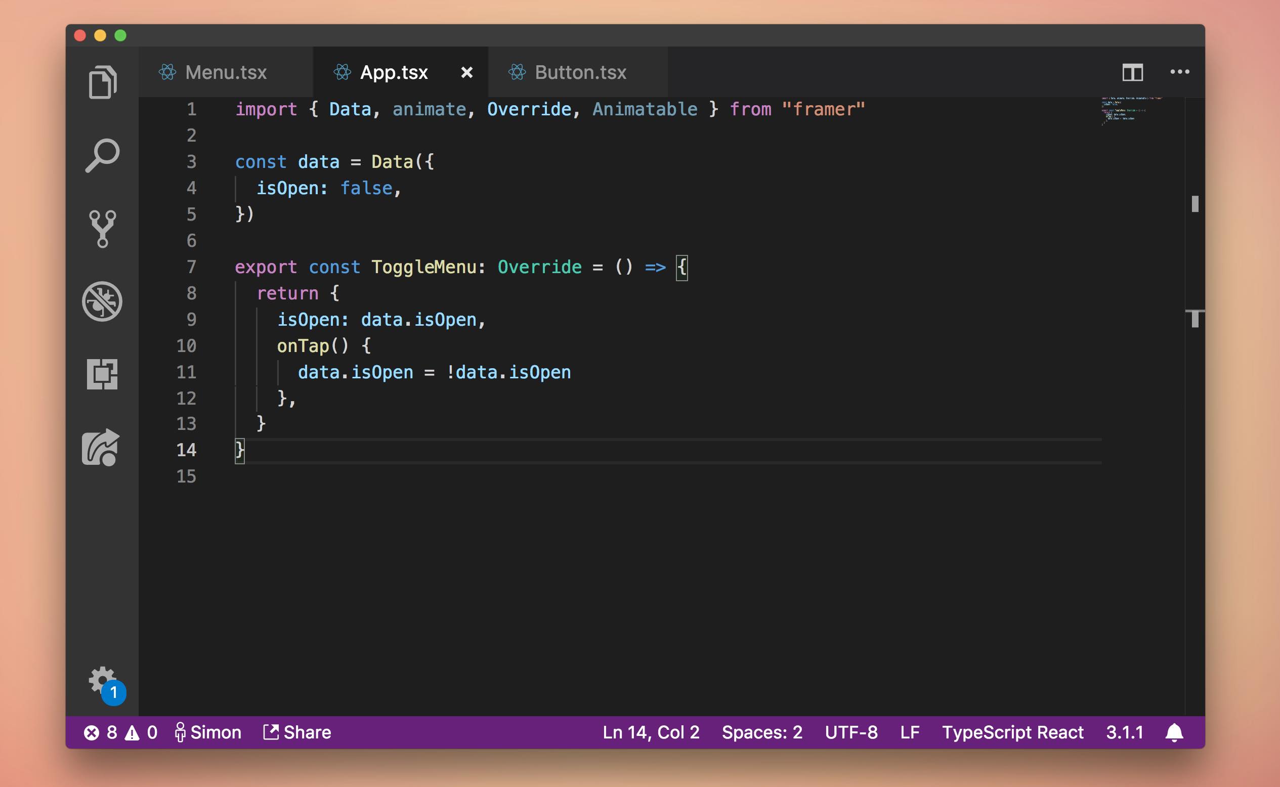
First define the data you want to hold in that file.
const data = Data({
  isOpen: false,
})
Then create a new Override. let's call it ToggleMenu.
export const ToggleMenu: Override = () => {
  return {
    isOpen: data.isOpen,
    onTap() {
      data.isOpen = !data.isOpen
    },
  }
}
Your final App.tsx should look like this:
You can now bind the Menu and Button component in FramerX to that Override.
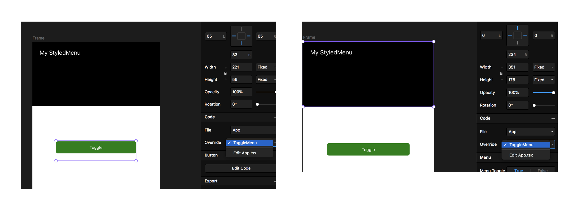
In Menu.tsx and Button.tsx you are now able to access the return of ToggleMenu Override as normal properties.
Open Button.tsx and let us use setup a onClick handler.
onClick = e => {
  const { onTap } = this.props;
  onTap && onTap(e.target.value);
};
render() {
  const { isOpen } = this.props
  return (
    <StyledButton active={isOpen} onClick={this.onClick}>
      Toggle
    </StyledButton>
  )
}
You final Button.tsx component should look like this:
Now you are able to setup shared data between components in FramerX!
Thanks for reading! I’m Simon Franzen, co-founder of zauberware.
Feel free to connect with me via Twitter.